Science Online: Cultures Clash over Infographics


Today’s been an interesting contrast with yesterday. dConstruct was very much a temple of the converted, discussing elements of web design theology. Science Online is much more of a culture clash, with the social media crowd meeting sceptical scientist, and coming away with a draw at best. (In that, it reminds me far more of news:rewired.) Nowhere has this clash been more clear than in the presentation by David McCandless, who spoke at both conferences.
Information is challenged

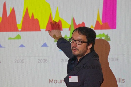
I’ve blogged about McCandless before, and his presentation was much the same in all cases. He does fantastic story-telling through data visualisation, and his presentation was very warmly welcomed by the dConstruct crowd. The Science Online attendees also took to his infographics pretty quickly, at least while the topics was slightly outside the scientific mainstream. The closer they got to science, the more twitchy the audience became. The reason why became apparent pretty quickly. Challenges came to the labelling of one slide, to the data methodology on another. In the questions, he was challenged on the lack of axis labelling on his more graph-like visualisations.
And here was the culture clash – people who have been drilled by years of practice to present data in very clear, systematic and comprehensible ways meeting those who are, essentially, storytelling through data and graphics. I hope people from both sides learnt something from this: the scientists the value of making things comprehensible for a lay audience, the visualisers the fact that a greater degree of rigour can give your work more impact.
And, in a way, I find these sorts of encounters more satisfying than “preaching to the choir” conferences. Through these clashes, we can actually see learning happening, rather than beliefs being reinforced.
